-

- Forums
- Chatrooms
- Gallery
- Gameplay Videos
- Upload
- Articles
- Mod Reviews
- Shop SP: Games, Movies, Books

Every so often websites need a refit, and Sorcerer's Place is no exception.
For many months, our team has been working behind the scenes to bring you a site with numerous new features, and potential for unlimited expansion. The new site design is the first step on this path. As always, providing you with the information and content you need, in a quick and timely manner, was our primary goal, while at the same time offering a new and fresh environment to explore the site.
First, a few words about the site navigation. You will notice that on every page, there are now two main navigation tables, one on the left side (Sections), and one on the right (Subsections). The Sections table is static and unchangeable, whereas the Subsections table always shows the subsections of the section you are currently in. So, for example, if you click on the Fantasy Books link in the Sections table, you will be taken to the index/introduction page for that section, and a listing of all the pages in the section will appear in the Subsections table on the right. The system works the same throughout the entire site. Also, in the middle of all pages, above the content, there is a "Location:" line, which tells you exactly where you are in terms of sections/subsections.
Speaking of navigation, take a look at the Features table on the right side of the page; specifically, the Search link. SP now finally has a search engine, which should be of great help to those looking for something specific on our pages.
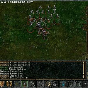
Our regular visitors will notice that all the existing content from the previous SP design has been converted to the new design, while some of it was also re-organized into sections more clearly. The most popular features have been added to the Features table on the right, which displays on every page and provides easy access to our popular destinations. The Weekly Poll, Weekly Screenshot and Latest Release are now also visible on all the pages, so it is no longer necessary to visit the front page to view any of these features. A new feature, the Hourly Quote, is located lower on the right side of every page.
While all of the sections have been updated and refreshed for the new design, I would like to especially point out the two new ones: SPS Accounts and Info/Contact. The latter's most notable subsections are the SP FAQ and Submissions. The SP FAQ is a list of questions regarding SP which are regularly asked by our visitors, while the Submissions page details the guidelines all content submissions to SP should follow.
The SPS Accounts are probably the most important new feature of the redesign. They provide a couple of default donation options, and in return grant our supporters cool perks on our message boards and site.
Give the new site a whirl - there are many other new things not listed in this brief introduction. Sorcerer's Place is developing more and more each day. New improvements and more content will be added regularly. I hope you like what we've done so far and I look forward to hearing your comments on the new site. If you would like to pass them on to me, please contact me, or post in this thread. Please use our contact form to report any missed bugs or broken links.
My special thanks for help with this project go to Catbert (code), Blackthorne TA (converter scripts), Sor (quotes), all the beta-testers and the entire community. I could not have done it without your support.


